Dialog System
Dialogs in the Visual Novel Machinery are created by creating a Dialog Blueprint in the editor.
To create a dialog blueprint, right-click in the content browser in a folder of your choice and select “Dialog Blueprint” in the VNM category.
Anatomy of a Dialog
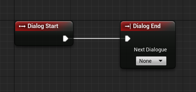
A dialog generally consists of a beginning and an end. What is important is that there can only ever be one start point, but infinite endings for a dialog object.
# Dialog start node is not specially added to the script
dialog.end
The start point of the dialog is represented in the Graph Editor with the Dialog Start Node.
An ending is represented in the Graph Editor with the Dialog End Node. If a dialog sequence does not end with a Dialog End Node, then the dialog will just halt at this point and never end. Additionally, if you don’t select a follow-up dialog, then Visual Novel Machinery will send the player to the Main Menu Level specified in the project settings.
Between the start and the end, you can add all of the nodes.
Basics - Linear Dialog
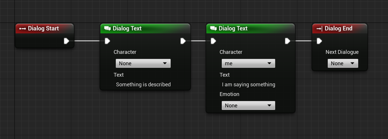
The most basic node that you will always need with a Dialog System is a node to display text. For this the Visual Novel Machinery offers the Dialog Text Node. In its most basic form, this node will display a text on screen in the dialog box. The text specified in the node is of data type Text, meaning they can be localized.
However, this is most likely not enough. The node can also display the name of the character talking. To have characters available for selection, you’ll need to add a character to the Character Definitions Data Table that is set in the project settings. In there you can specify the display text and color of the text. the other settings are for now not important to us. For more details on those, check the character feature documentation.
Now add multiple Dialog Text Node in sequence, and you have created a simple short linear dialog using Visual Novel Machinery.
dialog.text "Something is described"
dialog.text -character=me "I am saying something"
dialog.end
Basics - Branching Dialog
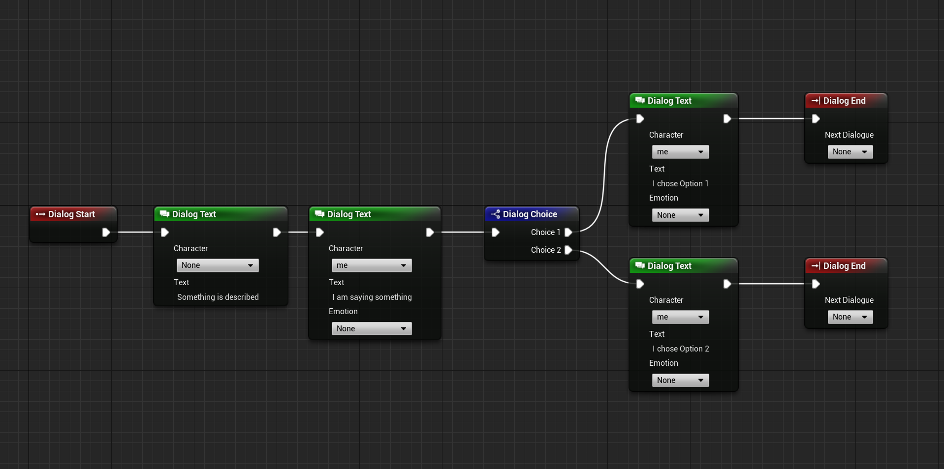
Sometimes a linear story is not enough and you want to go ahead and branch it with user choices. For this the dialog system supports player choices. These can be created using Dialog Choice Nodes. To add choices to it, click on the node and specify them in the Details Panel. The most basic choice could be a yes/no or up/down choice. It is up to you to decide which options the player has. These options will then be displayed as buttons for the user to click. Each choice added is internally of data type Text, meaning they can be localized.
dialog.text "Something is described"
dialog.text -character=me "I am saying something"
dialog.choice "Choice 1" choice1 "Choice 2" choice2
	:choice1
	dialog.text -character=me "I chose Option 1"
	-> endchoice
	:choice2
	dialog.text -character=me "I chose Option 2"
	-> endchoice

:endchoice
dialog.end
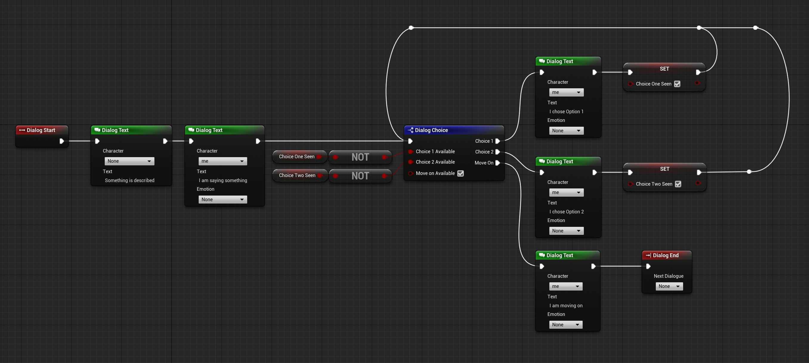
But, sometimes the player has to work for certain choices to be available. For this reason the Dialog Choice Node supports making all choices conditional. This means only if a certain condition is met, then the choice is displayed to the player. For example, if the player hasn’t opened a door, then the choice to close it would be hidden. Alternatively, if the player has already viewed something, then the option to view the object is hidden.
var bool ChoiceOneNotSeen
var bool ChoiceTwoNotSeen

dialog.text "Something is described"
dialog.text -character=me "I am saying something"

:beforechoice
dialog.choice.conditional ChoiceOneNotSeen "Choice 1" choice1 ChoiceTwoNotSeen "Choice 2" choice2 true "Move On" moveon
	:choice1
	dialog.text -character=me "I chose Option 1"
  	ChoiceOneNotSeen=false
	-> beforechoice
	:choice2
	dialog.text -character=me "I chose Option 2"
  	ChoiceTwoNotSeen=false
	-> beforechoice
	:moveon
	dialog.text -character=me "I am moving on"
	-> endchoice

:endchoice
dialog.end
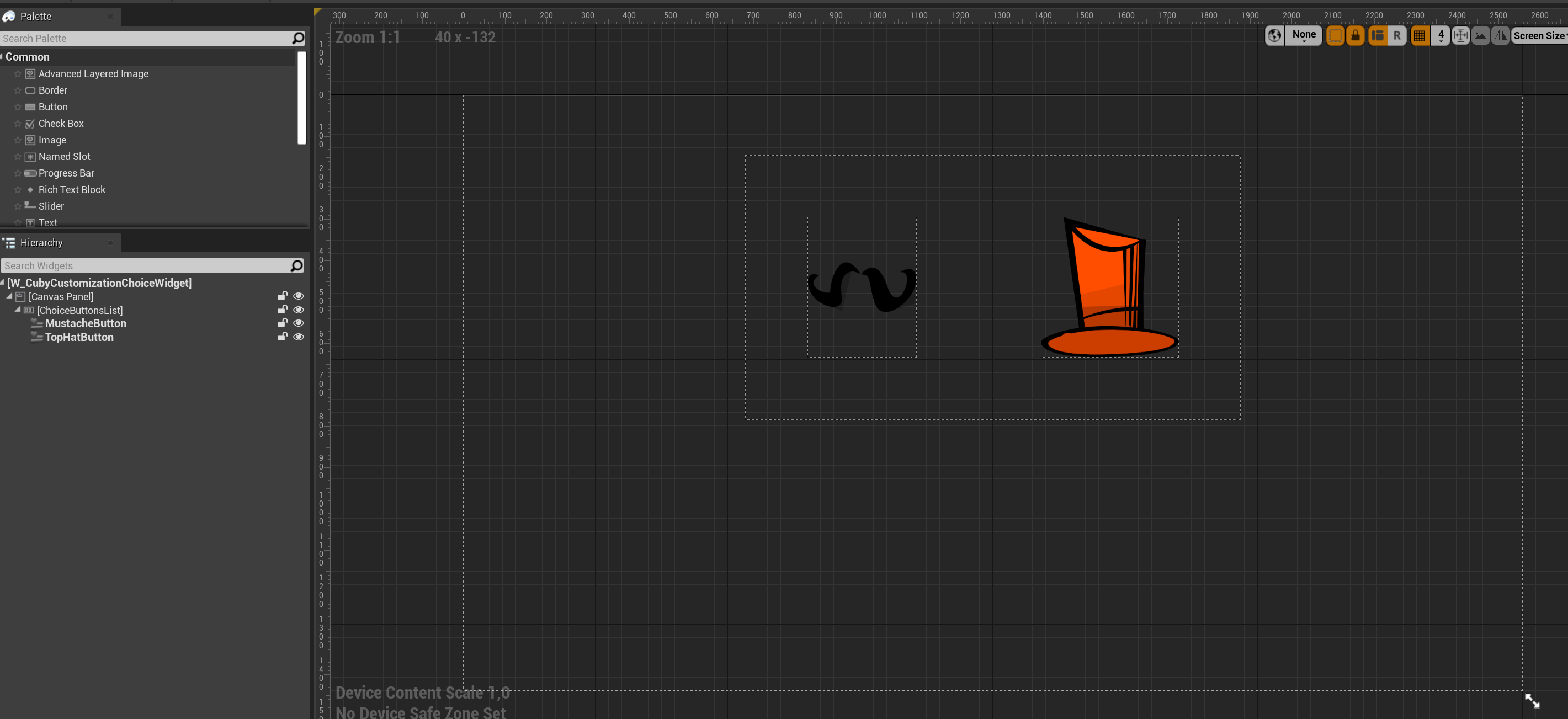
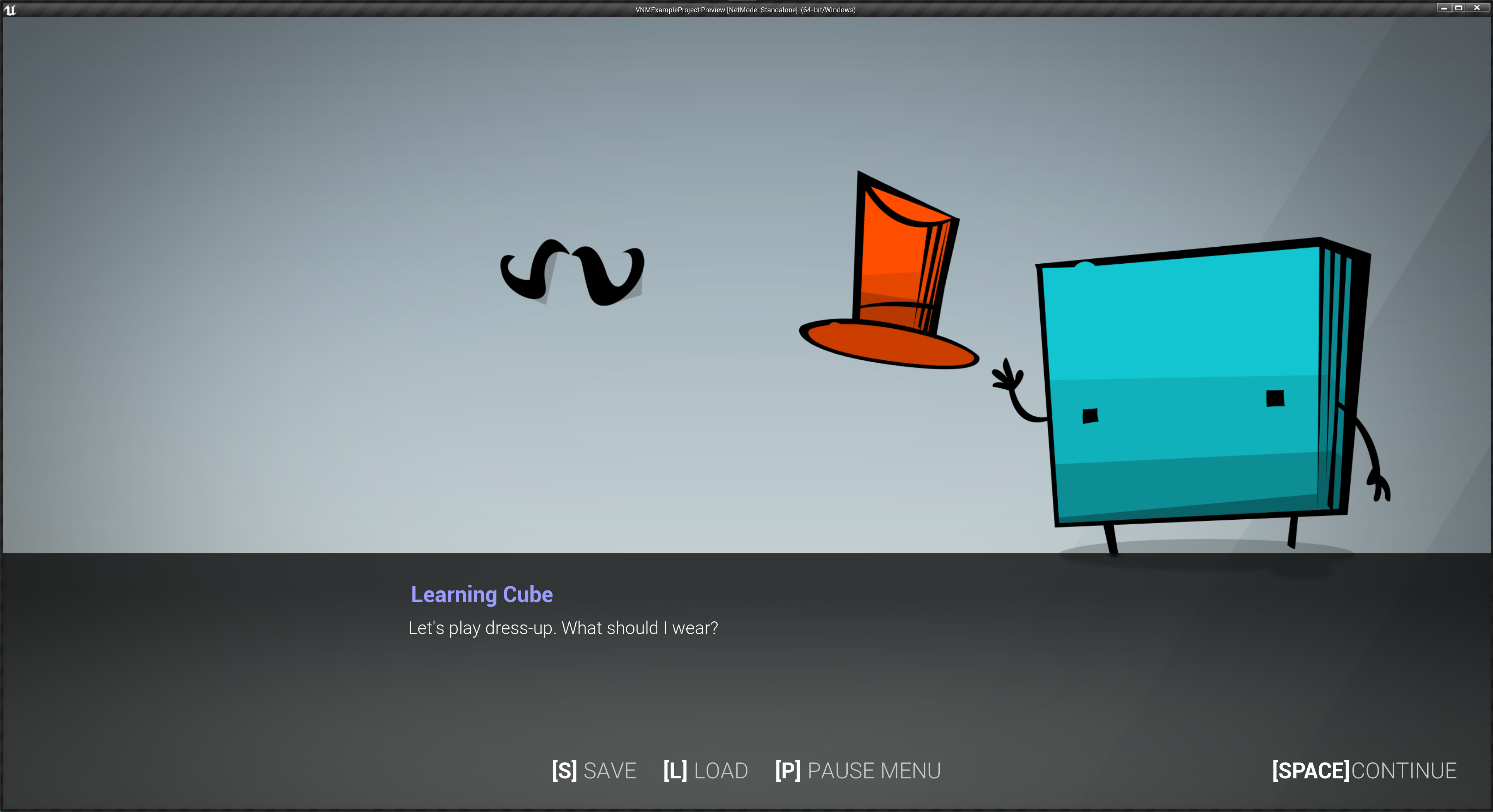
Advanced - Image Choices
Sometimes you want a player to maybe select a location on a map or select images instead of buttons for them to make a choice. For this option Image Choices exist. You can configure this directly in the details of a Dialog Choice Node. To make a choice an image choice make sure to check “Is Image Choice” and set the Image Choice Widget class to your widget.
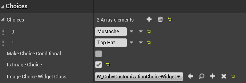
The Widget needs to derive from the class Base Image Choice Widget. The reason it is always a custom widget is so that you can design it exactly in the way you want it to appear to, as most likely each image choice sequence is unique.
In your Image Choice Widget you’ll need to add a Panel Widget (a Panel Widget can be a Canvas Panel/Horizontal Box/Vertical Box/…) named ChoiceButtonsList. In this panel you’ll need to add in all your Image Buttons. Make sure the widgets you add to the panel derive from the class “Base Image Choice Button” to ensure everything is handled properly. The plugin also already contains a already setup Image Choice Button called W_ImageChoiceButton, which you can use instead if you don’t want to set up your own.
After you have created and designed your image choice widget to your liking, set it on the Dialog Choice Node and you are ready to go.
Advanced - 3D Choices
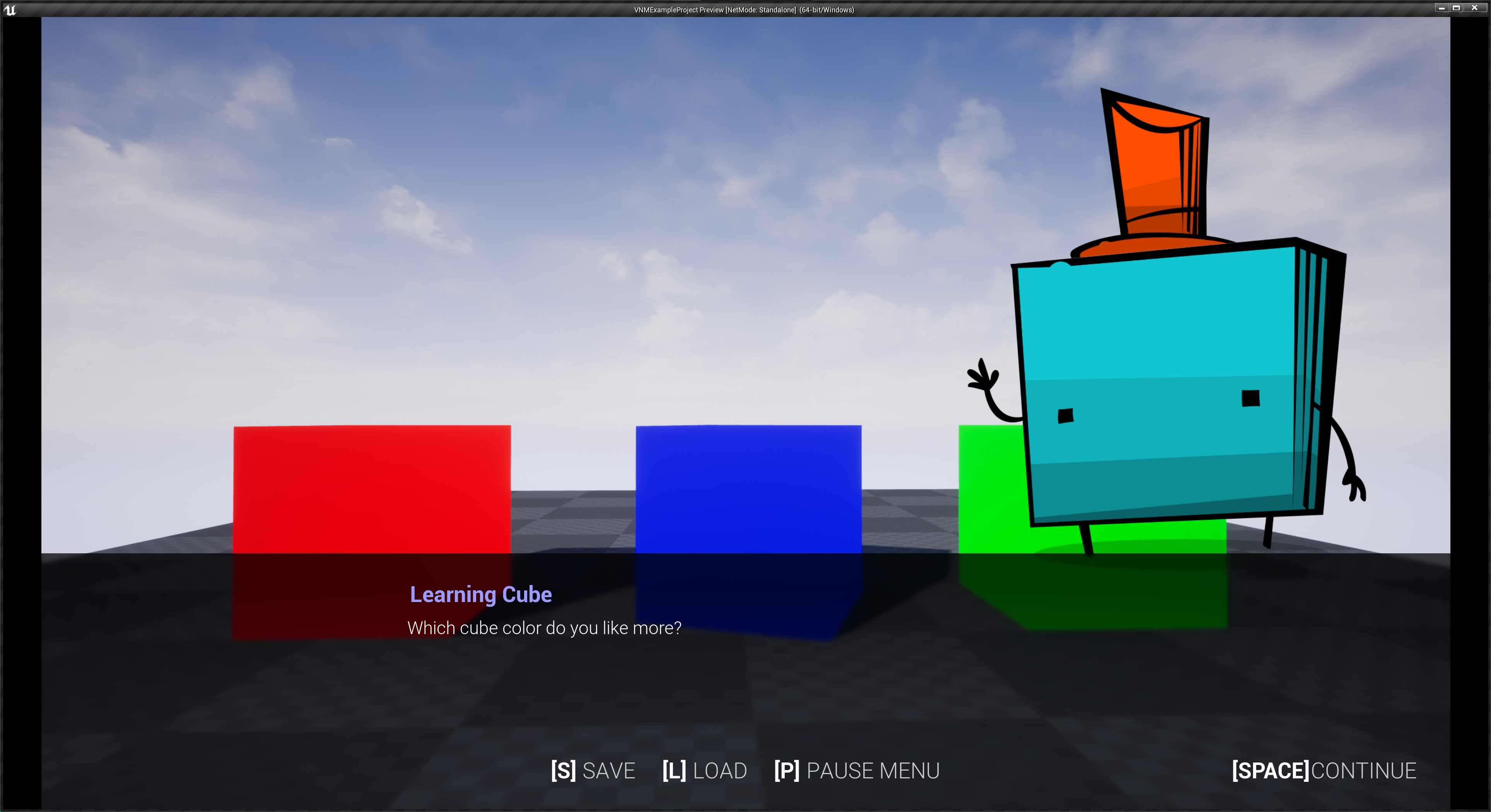
The same way you can do stuff in 2D for choices, you can do things in 3D with choices as well. Before using 3D choices, make sure you have a Dialog Scene loaded, to make sure the choice system can actually find your choices in the 3D World.
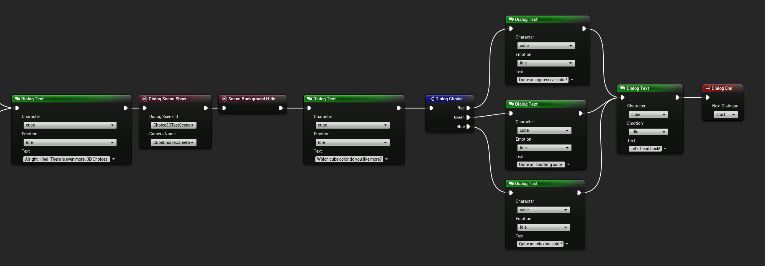
In your Dialog Scene you’ll need to add actors that derive from the classes VNMChoiceActor/VNMChoicePawn/VNMChoiceCharacter depending on what you need in your scene. In these actors you need to set the Choice Id to the text you set in the Dialog Choice Node, so that they can react if they are relevant for a choice.
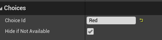
Afterwards, you can check the setting “Is 3D Choice” on your Dialog Choice Node, and the choice will work as a 3D Choice.
Advanced - Dialog Window Controls
From time to time it can happen that you want to do something special with the dialog window. For this reason there is a Dialog Window Control Node. This node can be use to play animations on the window widget, or to hide and show it. In general if the node is never used, then the dialog window is set to automatic mode, meaning it will automatically show at the beginning of the dialog, or hide at the end of the dialog. This could be useful for example if your character becomes deaf during a dialog sequence, and therefore you want to hide the dialog box.
Advanced - Dialog Text Stylization
There might potentially be a need that you want to highlight part of the text in a different color. For this reason the plugin uses a RichTextBlock in the UI. With this you can use tags like <green></> as an example. To create these tags, the blank project template has a data table called DT_DialogTextStyling. In this data table it is possible to create these tags for styling the dialog text. Unreal Engine offers also the usage of RichTextBlockDecorators that can be used to do even more customization, like displaying images in text. This however is not setup by default in the project template.
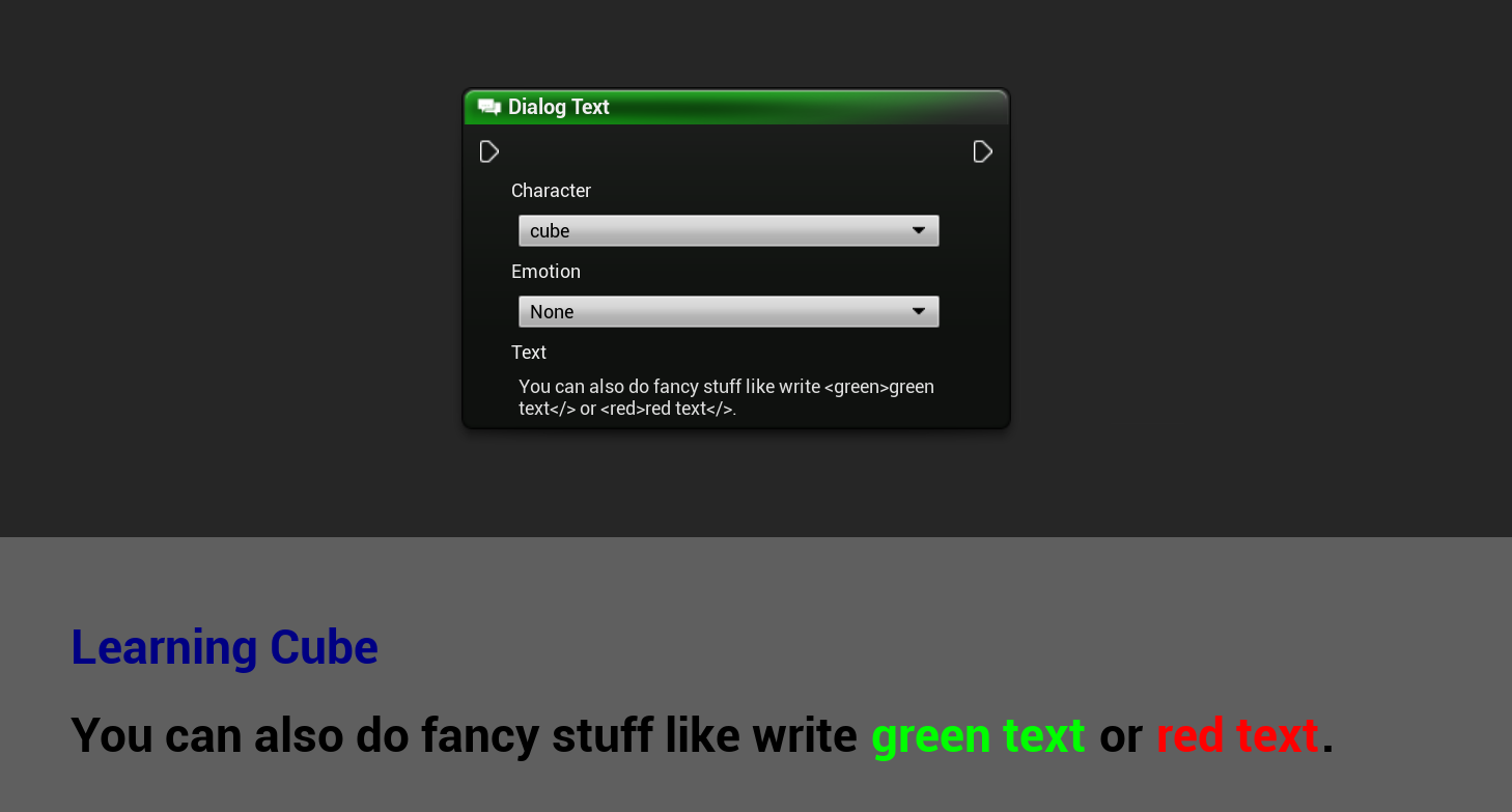
dialog.text -character=cube "You can also do fancy stuff like write <green>green text</> or <red>red text</>"